The Slider has been around in iOS since the beginning. Apple included it in the SwiftUI framework beginning with iOS 13. The slider is a simple UI control that allows you to slide your finger across the screen and update a value behind the scenes. The last time I wrote about it was about 12 years ago demonstrating it with Objective-C code and a Storyboard. It’s time to provide a more current example.
Adding a UISlider to the View
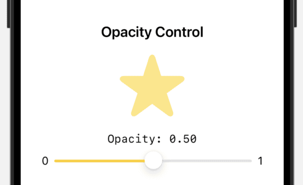
struct ContentView: View {
    @State private var opacity: Double = 0.5

    var body: some View {
        VStack(spacing: 20) {
            Text("Opacity Control")
                .font(.title2)
                .fontWeight(.semibold)

            Image(systemName: "star.fill")
                .resizable()
                .scaledToFit()
                .frame(width: 100, height: 100)
                .foregroundStyle(.yellow)
                .opacity(opacity)
                .animation(.easeInOut, value: opacity)

            VStack(spacing: 8) {
                Text("Opacity: \(String(format: "%.2f", opacity))")
                    .font(.system(.body, design: .monospaced))

                Slider(
                    value: $opacity,
                    in: 0...1,
                    step: 0.01,
                    minimumValueLabel: Text("0"),
                    maximumValueLabel: Text("1")
                ) {
                    Text("Opacity")
                }
                .padding(.horizontal)
                .tint(.yellow)
                .onChange(of: opacity) { oldValue, newValue in
                    print("Opacity changed from \(oldValue) to \(newValue)")
                }
            }
        }
        .padding()
    }
}
We begin with an @State property wrapped variable called opacity that stores a double value.
We include a VStack for our layout and add a Text view first followed by an Image view. We specify an SF Symbol to use as an image and add various modifiers to size it as needed. We use our opacity state variable from earlier to determine opacity.
We add another VStack that has a Text view to show the opacity followed by the Slider view.
Slider has a binding to opacity specified in the value which is set to $opacity.
Line 24 sets the range of the slider, in this case it will go from 0 to 1 with the … meaning it includes both the zero and one.
Our lables are what are added to the beginning and end.
We then set the Text view in the slider to say “Opacity”.
Line 33 includes an onChange which is called each time the slider moves. It provides the old and new value which we just print on line 34 to the console which gives something like this:
Opacity changed from 0.59 to 0.58
You might opt to call a method here or do something else that accomplishes what you need.
This is a relatively simple UI control that has been common to see in iOS apps for a long time.
For next steps, I would suggest adjusting the range and step to see what happens. Sometimes you might need 0…255 or whatever, and other times you might need a far smaller range. Either way, just pass in the values and the slider and change event will keep track of what is needed.
Note that .onChange was only used here to print to the console. The opacity changes without it. I just included it to show a variation of what is available when the slider is moved.
Leave a Reply
You must be logged in to post a comment.