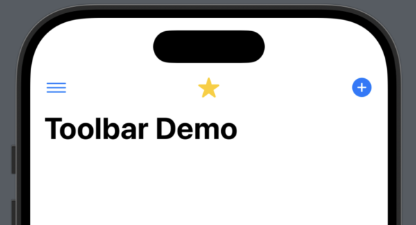
In this tutorial, we’ll add Buttons to a NavigationStack toolbar and position them correctly according to your needs. To demonstrate what can be done, we’ll add animations to the buttons based on the SF Symbols tutorial.

struct ContentView: View {
    @State private var isAdding = false
    @State private var isMenuOpen = false
    @State private var isStarred = false

    var body: some View {
        NavigationStack {
            Text("Toolbar with Animations")
                .font(.title)
                .padding()
                .navigationTitle("Toolbar Demo")
                .toolbar {
                    ToolbarItemGroup(placement: .bottomBar) {
                        Button("Left") {
                            print("Left")
                        }

                        Button("Right") {
                            print("Right")
                        }
                    }

                    // Hamburger Menu (Top Left)
                    ToolbarItem(placement: .navigationBarLeading) {
                        Button {
                            isMenuOpen.toggle()
                        } label: {
                            Image(systemName: "line.3.horizontal")
                                .symbolEffect(.breathe, value: isMenuOpen)
                        }
                    }

                    // Star Button (Centre)
                    ToolbarItem(placement: .principal) {
                        Button {
                            isStarred.toggle()
                        } label: {
                            Image(systemName: isStarred ? "star.fill" : "star")
                                .foregroundColor(isStarred ? .yellow : .primary)
                        }
                    }

                    // Plus Button (Top Right)
                    ToolbarItem(placement: .navigationBarTrailing) {
                        Button {
                            isAdding.toggle()
                        } label: {
                            Image(systemName: "plus.circle.fill")
                                .symbolEffect(.bounce, value: isAdding)
                        }
                    }

                }
        }
    }
}
The example above shows how the .toolbar can be used.
View Setup
First, add in @State property wrapped variables to hold a value that can be observed later on. This will be explained later.
Next, set up a NavigationStack and inside, a Text view where we set the font, padding, and give it a navigationTitle.
Adding the Toolbar, Bottom Nav
The toolbar modifier on line 12 signals the beginning of adding ToolbarItem’s to the view.
On lines 13-21, put some items in a TabbarItemGroup that has its placement set as the bottomBar. Adding two Button views here puts the first one on the left of the bottom bar, and the second on the right of the bottom bar.
If you introduce more buttons, then the Buttons are added from the left with the last button declared automatically being shifted to the far right.
Top ToolbarItems
Next, on line 24, add a ToolbarItem and set the placement to .navigationBarLeading which means on the left. For animation purposes, as seen in the tutorial linked above, a boolean is toggled. We also set the Image view on lines 28 and 29 to use the .breath effect which runs when the isMenuOpen @State is changed.
Repeat the same for the centre button, set by setting placement to .principle (there can only be one principle from my testing), and then finally have a final button added with the placement of .navigationBarTrailing.
Both the leading and trailing can have extra buttons, but I suggest going easy as you don’t want to add too much clutter to your view unless absolutely necessary.
From my own testing, it seems that you can fit about 8 buttons in the navigation bar, after which, you get a build error.
The Buttons in the top naviation populate left to right for each of the outer placement options, with the principle placement only allowing for one.
You will see many apps use .toolbar as its a common practice to have buttons up top for users to select options.
Leave a Reply
You must be logged in to post a comment.