For the last few weeks, I have been making plans for a new iPad/iPhone, and potentially macOS application. I haven’t used SwiftUI much in development so wasn’t sure how best to sort out the navigation on both mobile devices.
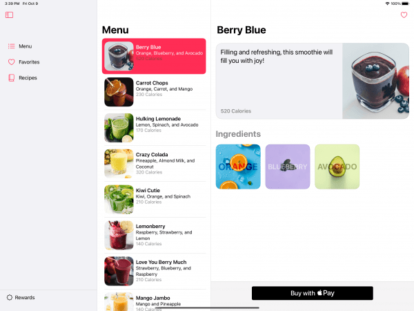
The app I am building, which is in very early stages, is for note-taking and meeting planning. My plan was to use a two-column layout, much like master/detail, but it seems that one good option is the three-column layout that has a menu on the far left column, a list view in the centre column, and then details on the rest of the view, as seen below.

After some searching around I stumbled across some sample code by Apple of an app called Fruta. Although Fruta is showing off the abilities to use App Clips, Widgets, Sign in with Apple, etc…, which is really helpful, the most interesting part for me is the demonstration of how a three-column layout works on the iPad.
The left column on the screenshot above can be hidden. This opens up more space for the detail view on the right which is where the users of my app will be spending much of their time interacting with. Although I want to provide the ability to hide the middle column as well, this particular layout in Fruta gives me a great start.
For the iPhone the three column layout in Fruta works differently. Instead of a far left menu column, it makes use of tabs at the bottom of the view. This will likely work well for my application.
I just thought I’d share this for those of you who want a good example of how a three-column layout with SwiftUI can work.
Leave a Reply
You must be logged in to post a comment.