I have been a user of PaintCode since June 2012 when I downloaded version 1.1.1. PixelCut recently launched a new version, version 3, that brings Swift 3 compatibility to the mix amongst a few other features. The current version is priced at £99 which seems reasonable for the amount of time saved when creating resolution independent images for your app. Lets take a look and see what you can do with PaintCode.
The idea behind PaintCode is that you draw shapes in vector form, and then provide optional adjustments by using a simple expression language to add movement or changes to those shapes. Throw in some variables for colours, size, position etc… and then import that in to your app by way of a StyleKit and you have a real simple way of creating clean looking icons, charts, and other items to be used in your app. When the StyleKit is added to your Xcode project you can make calls to the class and use UIDraw to put your drawings on screen. The benefit is that you get resolution independent images that can look crystal clear at any size. This prevents the need to export @1x, @2x, or @3x and then regenerate if an @4x appears. Likewise, cutting down on the assets and putting them in code can be a great benefit for controlling the size of the app.
This tutorial demonstrates how you can make a line graph with PaintCode for your iOS app. This tutorial will form part of another tutorial which will demonstrate in more detail how to make the line graph usable within an app.
Download PaintCode
To get started you need to download PaintCode from the PaintCodeApp.com website. A 5 day trial can be downloaded and is sufficient for this tutorial although I highly recommend purchasing it if you are an iOS developer looking for a way to draw images with code rather than create elsewhere.
The app will open with a blank canvas. Along the bottom middle section are buttons for what to export, what version of the selected language as well as the origin on the canvas. For iOS we’ll use iOS – Swift, Swift 3, and the Default Origin.
On the right hand side of the middle section you have Infinite Density or you can set the resolution to 1, 2, or 3 times. This is merely just to decide on what you see within PaintCode and doesn’t change the output of the Swift code. I just keep mine at Infinite Density although I can see benefits of 1x etc… so that you can see how your drawings would look at a different pixel density. After that we have the zoom level of the canvas. Just set this to whatever works with you. I typically flick somewhere between about 200% and 1,200% depending on if I need to work at a point level.
If you hover the mouse over the centre of that bottom toolbar you will notice that you can left click and hold and then drag the bar up the screen. This reveals the Swift code which changes each time you make adjustments to objects on your canvas or by making changes to objects properties such as colours, variables, shadows, etc…
Setting up the PaintCode Canvas
Rather than trying to cover each and every menu item and option within PaintCode I’ll just mention the ones that we will see being changed. At the top you will see a tab called Tab (currently selected) and a StyleKit tab. I like to rename Tab to something representing what it contains; in this case we can call it LineCharts to represent the line chart that we will create. I used plural because we might add more variations of a line chart at a future date to that tab. Change it by double clicking on the tab’s name. If you have difficulties with that (the double click seems a little flimsy sometimes) you can select “Tab” on the small dropdown at the top of the right column. When selected, an option is made available in the sidebar to change the name.
![]()
A tab is just a way that you can organise your canvases. Each tab can contain 1 or more canvases. Each time you add a new canvas, a new method is created in the StyleKit export allowing you to draw the canvas on your device.
Next, click on the canvas and change its title to 7PointLine.
Select the canvas and set the width to 375 and the height to 232.
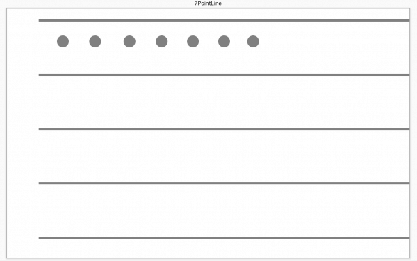
Lets now draw the points and a connecting line between points. This step requires clicking on the Oval tool at the top left of the app, and then clicking on the canvas and dragging an oval out. In the inspector on the right hand tool bar, set the width and height to 11 pixels each. You can then select the circle, right click, copy, and then paste it to make 7 dots in total. These need to be positioned evenly across the canvas, but we’ll come back to that in a few moments.
 Draw a rectangle in an empty space on the canvas. Select the rectangle and then alter it’s position and size in the inspector on the right side toolbar. X should be 30, Y should be 10, W should be 345 and H should be 2. Copy and paste 4 more of the same lines and position them as follows:
Line 2: X = 30, Y = 60.5
Line 3: X = 30, Y = 111
Line 4: X = 30, Y = 161.5
Line 5: X = 30, Y = 211
At this point it would be wise to rename the object names on screen. First, position your dots horizontally as seen below. Name the first one point0, second as point1, and so on till point6. Rename the lines to topLine, middleLine, bottomLine, etc…
Lets now connect the dots with a Bezier. Start at the point on the left and click in the centre, and then click in the centre of each point until you reach the end. Hit escape when done.

We now need to work with frames. A frame is a tool that allows you to box objects together on the canvas so that when the frame is moved, all contained objects also move. Select the Frame tool and then draw a box/frame around point0. Make it 1 pixel larger on the width and height, but start from the top left corner as seen in the image below. Also select the “Apply only to entirely enclosed shapes”. The reason for making it slightly larger is that for some reason, when moving the frame, the point doesn’t stay within the frame. I found that if you expand the frame area a little it doesn’t drop the point.
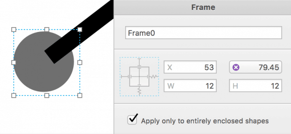
Repeat this for each point. When done, you can select any frame and adjust it’s Y property and see the bezier follow the point.

We will now position the points across the X axis evenly. To do this I started with the middle point of one of the horizontal lines and then evenly spaced out to the left and right until all looked good. Rather than positioning points, set the X value for each frame as follows:
Frame0 = 53
Frame1 = 101
Frame2 = 149
Frame3 = 197
Frame4 = 245
Frame5 = 293
Frame6 = 341
Adding Colour Variables
We now want to add some colour to the chart. There are a few options here. One is to manually set the colour by selecting the line and then setting its colour. A better way is to use the Colors section in the library and define the colours in there and assign them to each shape on the canvas. To do this, left click in the small dot in the left bar next to Colors. Drag till you attach it to the bezier. Select the “Fill” option. A box will appear that you can name this “line” and then you can select what colour you would like the line to be. Note that the line overlaps the point. To move the line back; which is a better option in my opinion; you can select the bezier in the right sidebar and drag it below all of the points. The higher up the shape on the sidebar, the closer it is to the screen. You would also want to ensure that all horizontal lines are at the bottom so that the dots and bezier overlap the lines rather than the other way.
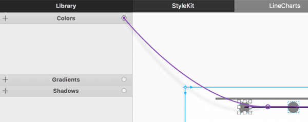
Repeat this process for the top horizontal line and set the colour, perhaps to light grey. When done, you can click and drag from the dot next to the new colour and select the remaining horizontal bars one at a time.
Repeat the same process, but create a new colour for a point. Click and drag to each point to get them all to match colours.
By the end of it you will see the following (in the colours of your choice):

If you double click on any of the colours, you can adjust and see all connected items change in colour.
One last change to make to each colour is to open it up in the sidebar, click the gear icon and select the “Parameter” option if not selected already by default. Selecting this allows us to change the colour of each item in Xcode.
Using Variables to Manipulate the Frames
Lets breath a little bit of life in to the line graph now by way of using variables. This is where PaintCode becomes even more useful. We could just export what we have and have a static graph showing on the screen, but what we need to accomplish is being able to have the iPhone app tell each dot where to be positioned on the Y axis so that we can use the graph to represent some real data.
Lets add our first variable. We will call it “height”. Set it as a number and set that number to 200.
Add another variable, but select “Expression” this time. Call it topValue and in the expression box, add the following “stringFromNumber(height)” (omit the ” “).
You will notice that this inherits whatever value is stored in the height variable. We will use this particular variable later on in the tutorial.
Add another expression variable called “middleValue” and set it to the following “stringFromNumber(height/2)”. This will set the value available to half the value and output it as a string.
Add the next which will be called “upperMiddleValue” and set that to “stringFromNumber(height*0.75)”.
Add another called “lowerMiddleValue” and set that to “stringFromNumber(height*0.25)”
Next, we will add some text to the canvas. Drag out a text box anywhere on some blank space. Set the coordinates and size to:
X = 5, Y = 1, W = 23, H = 21. Set the font to Helvetica Neue, and set the size of the font to 11. Align the text to the right.
Copy and paste the text field to the end of each of the remaining lines.
Rename the text on the bottom text box to “0”. The rest of them will be wired up to the variables. To do that, click on the circle of the topValue and drag to the top text box. Select the only option available which is “Text”. Notice that the string changes to what is in the topValue variable. Slide the height number up and down and you’ll see the string match what the height is. Repeat this for the remaining variables (but not the height). Change the height variable value by selecting it and then clicking and scrolling up or down. You’ll see all text on the chart being updated to the correct amount.
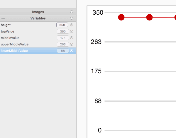
We want to be able to give the user the opportunity to set the bezier width. Create a new number variable, call it “lineWidth” and set the value to 2. Drag that to the bezier and select “stroke width” from the options. This allows the user to feed in a number to customise the look a little.
Setting the Point Variables
We will now set the point variables. We hit a few complications here because the default origin on PaintCode and iOS is the top left, but we are trying to position our dots counting up from the bottom. We need to use an expression to first, scale down or up the height vs the number of points available between the top and bottom line, and second, we need to then reverse that so that it counts from the bottom up rather than the top down.
Each frame needs 2 variables creating. The first is the value that we accept from the iOS app… the number that will be represented by the point; so a zero will rest on the bottom bar while the top number will rest on the “height”, whatever that may be. The second variable calculates all of this based on the value provided and then can be used to position the Y coordinate correctly.
Lets create 2 references first. We need to know where the top bar is and the bottom bar (just the Y coordinate for each).
So that we don’t accidentally reposition any of the horizontal bars, instead of hitting the + sign to add a new variable, we will drag from the small circle on the right side of the “Variables” menu. Drag from there to the top bar and select “Y”. Call the variable created from the top line “yTop” and repeat for the bottom line and call it “yBottom”. These 2 variables won’t need to be set. Just to ensure that these values are not changed, select the variable and click the cog icon and select “local variable”. Prior to that it would have been set to parameter which would have let the user make changes within Xcode. You might opt to do that at a later date so you can position other aspects of the graph, but for this tutorial we’ll leave them in a fixed place.
Add a new number variable called point0Value. Set it to 100.
Add an expression variable called point0Calculation and add the following:
yBottom – yTop – (((yBottom – yTop) / height) * point0Value)
I’ll explain what this does.
The last section in brackets finds the difference between the bottom and top value… in this case it would be 212 – 10 which means there are 202 points between the top and bottom line. This is our range. We then divide that by the height which provides the number of points moved for the height value. If the height was 100 then 2.02 points would equal 1. We then multiply that by the point0Value. So if point0Value was 100 then 100 * 2.02 would equal 202 which is where the point would appear on the chart… i.e., right at the bottom on the zero line. However, we actually need that to be plotted on the top line. To work that out we need to flip it over. We do this by yBottom – yTop and then – the previous answer. So if the point was needed at 202 then we do 202 – 202 which gives us 0 which is right at the top of the screen.
Although this sounds correct, the dot is a little too high because we are plotting Y based on the top edge of the point. We know that the point has an 11 point diameter, so a simple way is to add an offset in to the expression. I tested 5 and 6 and found that 5 points was the better offset. You could probably get away with 5.5 if you wanted to be exactly precise.
yBottom – yTop + 5 – (((yBottom – yTop) / height) * point0Value)
If we run some sample numbers through again based on a height of 100 and using the point0Value as 25, the latter part of the expression would be 50.5. This means we would plot 50.5 pixels from the top. Remember that this is the top edge of the point. This puts it just above the 3 quarter line. Add the offset of 5 pixels, it would put the dot on the 3 quarter line. But, 25 should put it on the bottom line. We run it through the rest of the expression which is:
yBottom – yTop = 202 and then minus off the previous answer with the 5 pixel offset in place, and we end up with 207 – 50.5 which equals 157 rounded. A quick test puts the dot right on the 1 quarter line which is where we expect 25 out of 100 to go.
Now that the value and calculation variables are in place for point0, drag from the small circle on the calculation variable and drag to Frame0 (not point0) and attach it to the Y value.
At this point you can now set point0 value by sliding up and down on the mouse and see the point move to the correct place.
Repeat these steps for each of the frames by copying and pasting and renaming the variables and expressions as needed (i.e., the point1Value, point2Value… etc… which is mentioned in each expression). By the end of it you should have a line chart that allows you to move each point as needed.
If you want to experiment with adding a background, go ahead and add a rectangle and drag it to the bottom of the stack on the right hand column. You might want to link up a gradient to it to give it subtle look behind the graph. Also feel free to make other changes although the export we do to an app will depend somewhat on the layout, so perhaps just adjust the style a bit if needed.
Exporting a StyleKit to Use in an iOS App
The next task is to now export the StyleKit so that we can use the drawing within an iOS app. To do that we click on the StyleKit tab. Notice that at the bottom we have 1 StyleKit drawing method (the chart we just created). Every canvas created will be shown here. Each canvas gets its own method. We could add the colours in at this point, but doing so only makes them available as getters within the app. We wouldn’t be able to change the colours. For that reason, we’ll leave the colours section along.
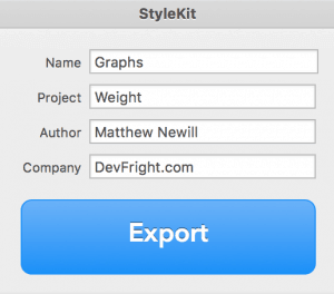 In the right column, name everything appropriately. You can call it what you like here. Here is what I called mine. The project name “Weight” might indicate where this tutorial will lead on to (a Weight tracker using data from HealthKit). Click the Export button and save to an appropriate location on your Mac. If you opted for Swift then just 1 file will be exported. It is this file that needs to be dragged in to an Xcode project.
A Quick Test in Xcode
Lets make a quick test in Xcode to see how the graph looks. Create a single view project with Swift. Visit the Storyboard and drag out a UIView of the same size as the canvas in PaintCode.
Create a custom class by pressing CMD+N and select Cocoa Touch Class. Name it LineView and make it a subclass of UIView and make sure Swift is selected. Create the file.
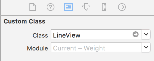
Back in the storyboard, select the UIView that you just added to the View Controller. Open up the right sidebar and select the Identity Inspector. Set the Class (under Custom Class) to LineView.
Open up LineView, uncomment the drawRect method, and use the following:
// Only override draw() if you perform custom drawing.
// An empty implementation adversely affects performance during animation.
override func draw(_ rect: CGRect) {
    Graphs .draw_7PointLine(frame: self.frame,
                            resizing: .aspectFit,
                            line: .red,
                            point: .red,
                            horizontal: .gray,
                            height: 350,
                            point0Value: 324,
                            point1Value: 345,
                            point2Value: 234,
                            point3Value: 123,
                            point4Value: 43,
                            point5Value: 345,
                            point6Value: 234,
                            lineWidth: 3)
}
Run the app. This example will literally just show a line graph in the app when run. Go ahead and make changes to the point values, lineWidth, colours, etc… and see what can be done. In the next tutorial we’ll start to customise the data so that we can make it more useful.
You can download the PaintCode file here.
The sample Xcode project can be found here.
Steve says
Excellent tutorial, thank you! Eagerly awaiting part 2!