Apple’s SF Symbols is a large amount of scalable icons that integrate with SwiftUI. The library has over 6,000 icons ready for you to use in your iPhone app.
Symbols come in nine weights and three scales, automatically align with text, and can be exported and edited using vector graphics editing tools to create custom symbols with shared design characteristics and accessibility features.
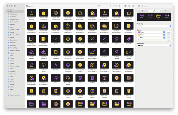
To help you find symbols to use in your app, Apple provides the SF Symbols app that you can download to a Mac to browse through the library. You can find details here.
In this tutorial we’ll look at how to use symbols and how to modify characteristics to suit the look and feel of your app.
If you have downloaded the SF Symbols app, you will see a similar layout to the screenshot above with a large list of all available symbols you can use. As seen in the right sidebar, I have the background set to dark and have adjusted some of the default colours. The purpose of this app is to help you find what you want and test different colours and animations. When you find what you want, you still need to manually add it into your iOS app. Thankfully, SwiftUI makes it relatively easy to do this.
Image(systemName: "speaker.wave.3")
    .imageScale(.large)
    .foregroundStyle(.gray, .blue)
This Image view uses speaker.wave.3 which was selected from SF Symbols. It has the scale set to .large and forgroundStyle of .gray and .blue. Each symbol has up to three colours that can be specified, although many use one or two.
Notice that if you change speaker.wave.3 to .2 or .1 at the end, you will see a slightly different symbol with the symbol appearing to be louder for .3.
To make the symbol responsive to actions from the user you can do this as follows:
@State private var volume = 1
.
.
.
Image(systemName: "speaker.wave.\(volume)")
    .imageScale(.large)
    .foregroundStyle(.gray, .blue)

Spacer()

Button("Tap Me") {
    volume = (volume % 3) + 1
}
The volume variable uses the @State property wrapper which defaults to 1. The Image view uses string interpolation so that the wave size can show that 1.
We have a button that sets the volume to cycle from 1 to 2 to 3 and back to 1. When you tap the button the “volume” increases and is represented in the symbol.
@State private var animate = false
.
.
.
Image(systemName: "speaker.wave.\(volume)")
    .imageScale(.large)
    .symbolEffect(.bounce, options: .repeat(3), value: animate)
    .foregroundStyle(.gray, .blue)

Button("Tap Me") {
    animate.toggle()
    volume = (volume % 3) + 1
}
This version adds in the .symbolEffect modifier. This particular method has options and triggers based on the value changing. We toggle a boolean and the icon bounces 3 times. We also keep in the volume which also changes while the symbol bounces.
@State private var mute = false
.
.
.
Image(systemName: mute ? "bell" : "bell.slash")
    .imageScale(.large)
    .contentTransition(.symbolEffect(.replace))

Button("Tap Me") {
    mute.toggle()
}
The code above animates, or transitions smoothly between bell.slash and bell. When you toggle mute, it redraws, but animates the slash to give a slick animated effect. You can swap out any of the symbols mentioned on line 5 for this effect to work.
Toggle(isOn: $mute) {
    Label("Mute", systemImage: mute ? "bell.slash" : "bell")
        .contentTransition(.symbolEffect(.replace))
}
The code above wrapes the symbol in a toggle along with a Label view. It sets the systemImage based on mute being true or false, and then uses the contentTransition to animate switching between the two.
Toggle(isOn: $mute) {
    Label("Mute", systemImage: mute ? "bell.slash" : "bell")
        .contentTransition(.symbolEffect(.replace))
        .symbolRenderingMode(.hierarchical)
        .foregroundStyle(mute ? .red : .blue)
}
.toggleStyle(.switch)
With these modifications, you can change the colours which uses red or blue depending on true or false. The .hierarchical setting for .symbolRenderMode allows the symbol to use different opacities for different layers which gives a feeling of more depth. Setting the foreground style will use the specified colour at primary, secondary, and tertiary variants.
@State private var animate = false
.
.
.
Image(systemName: "bell.and.waves.left.and.right.fill")
    .imageScale(.large)
    .foregroundStyle(.purple, .red)
    .symbolEffect(.bounce, options: .repeat(3), value: animate)

Button("Tap Me") {
    animate.toggle()
}
The example above shows how you can set the primary and secondary colours of a symbol. .foregroundStyle accepts one, two, or three colours passed in that represent primary, secondary, and tertiary. In this example we just use primary and secondary.
SF Symbols are a great addition to apps on the iPhone and given the number of variants and possibilities, it allows you to get your own unique style and animation with little effort.
Leave a Reply
You must be logged in to post a comment.