Working with Size Classes in Xcode 6
Making universal apps just became a lot easier with Apples introduction of size classes. Don’t be confused by the name. ‘Size Classes’ is a misnomer. It’s confusing because there are no classes involved in the way we’ve been taught about classes.
You will not end up with a Swift class file for the iPad or iPhone. The tool Apple has introduced should be called Device Designer, Size Layout Tool, or something along the lines of Device Morphing Layout Design Tool.
The concept is that during app creation, we get a crude representation of the project into the Storyboard, not worrying about the exact spacing or sizing of objects. Once the general design of the app is complete, then we can begin sizing it for specific devices.
WANY HANY
Every project starts with the large workspace by default. You will notice (once we begin our project) when looking at the Storyboard of a new project, that at the bottom center of the screen there are two words. wAny and hAny.
wAny translates to Width Any and hAny translates to Height Any. This is the default starting configuration of our workspace. So you could say this is the default size class.
Click on the words wAny hAny, and a pop-up appears with a grid layout. Move your mouse around and you’ll see the blue box move around while changing size and descriptions of the size configurations.
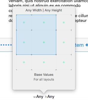
Mouse around the pop-up until wAny/hAny is displayed and click. This is where we’ll begin breaking down Size Classes with a sample project.
In this tutorial we will select universal as our app platform and explore the power of Size Classes. Auto Layout is tightly wound into these operations. In fact, Auto Layout is essential to using Size Classes. So you’ll also get to become more comfortable – if you were not already, with Auto Layout.
Along the way mistakes will be made and sometimes things get so messed up that you just need to start over. So always have a back up of your project before you start morphing it, manipulating, size classing it may become a last resort to scrap everything and start over.
Let’s begin
BUT WAIT! I don’t want to use size classes!
If you were designing strictly for the iPhone or strictly for the iPad, it would be simplest to uncheck Use Size Classes. You can do this once you have started a new project by selecting the storyboard, opening the utilities pane, and selecting the file inspector.
There you will see an option which can be checked or unchecked. Once that option is unchecked, you will be presented with a dialog box asking what size you are designing for.
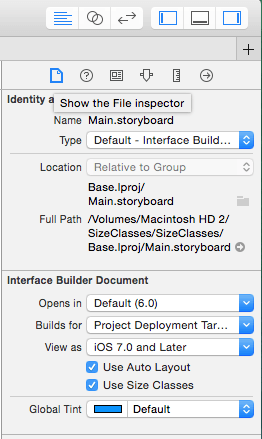
When “Use Size Classes” is unchecked, this dialog box appears.
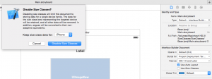
By clicking “Disable Size Classes” and choosing the iPhone, you are then presented with a storyboard workspace that more closely looks like an iPhone.
But this tutorial is about size classes so let’s begin again. While this might look long and tedious. It is easier to do than it is to describe, and the goal of this is to de-mystify working with Size Classes by demonstrating the capabilities.
Layout your design abstractly
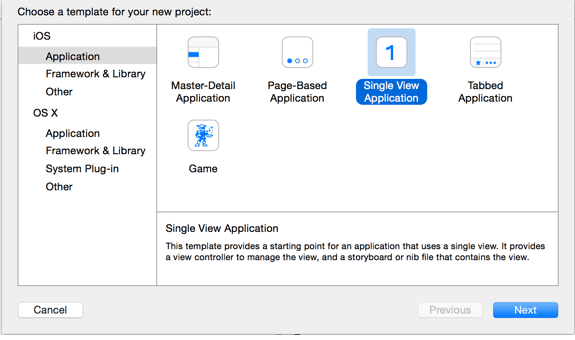
Create a new project. Single View Application. Select the Swift language and choose Universal Application.
and
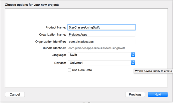
Once you have named your project and entered an organization name, your project is created and opens up. In the left pane youll notice only one Storyboard.
Click on Main.storyboard. Its quite large and can be a bit intimidating. At the bottom center of the screen is the current Size Class setting wAny hAny.
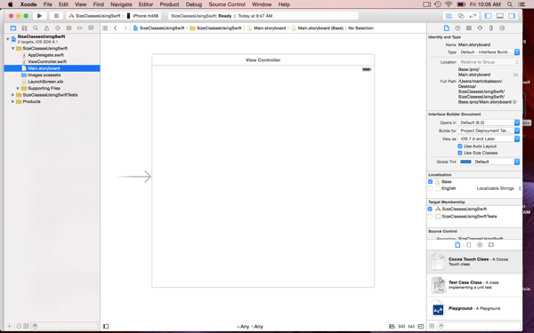
You’ll also notice that in the right pane (Utilities Inspector) if you have the File Inspector selected, Auto Layout and Size Classes are checked. These will be checked by default.
Now let’s drag some elements on the storyboard and get started.
In the lower portion of the Utilities inspector select the object library. Drag in the following elements. Two Labels, an ImageView, a Textview and a Toolbar. Drag three additional Bar Button Items into the toolbar. Center the labels, ImageView,and TextField, above the Toolbar. Add the Flexible Space Bar Button Item between the items in the toolbar.
To this point we have placed two labels above an image view with the text view below the image and a toolbar on the bottom with a total of four bar button items in the toolbar. Set the image view size to 300X200 and the Textview size to 300X160 other elements/objects are centered in the view. Your project should look like this.
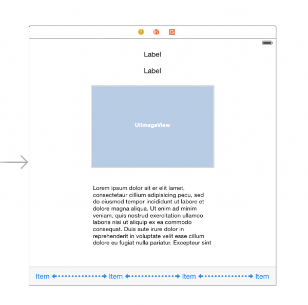
Select the iPHONE 5s in the simulator. Build and run the app. You should see that the objects are not where we would want them to be for iPhone5S!
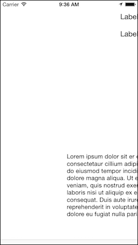
In the simulator menu select Hardware. Rotate the device left or right to view in landscape. You should see the following:
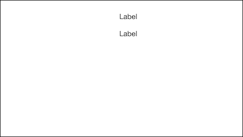
Not what we want!
The logical presumption here (at least to me) is that we could head up to the EDITOR menu and select RESOLVE AUTO LAYOUT ISSUES then select ADD MISSING CONSTRAINTS or RESET TO SUGGESTED CONSTRAINTS build and run again, and all would be visible and centered in the view. But it’s not that simple. If you try this, portrait mode displays correctly but we loose the image view in landscape, and our elements or objects get squished together.
However, Reset To Suggested Constraints is not a bad place to start, so that’s what we’ll do!
Make sure the View Controller is selected in the Document Outline! Head up to the EDITOR menu and select RESOLVE AUTO LAYOUT ISSUES then select RESET TO SUGGESTED CONSTRAINTS.
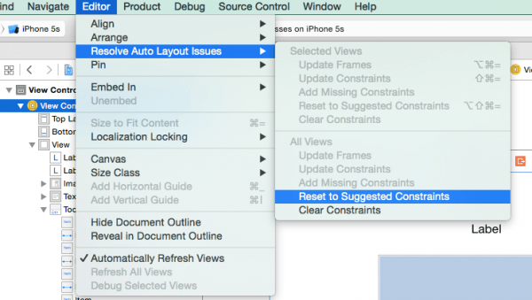
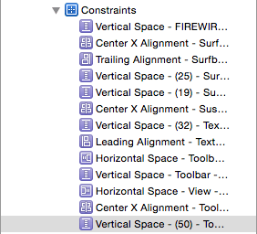
You’ll notice Xcode added a blue indicator in the Document Outline named Constraints.
If you open Constraints you’ll see all the constraint settings Xcode added automatically when we performed the operation described above.
If you Build and Run again, you’ll see that in portrait mode things looks better. The labels are centered, as well as the images, text view and toolbar. And when switching to landscape, the labels, textview and toolbar all appear to be correct. But, we loose the image view.
However, this is still a good starting point to begin using size classes.
Now we have a general layout with some Auto Layout constraints but we still have this generic square.
So what can we effect/manipulate/modify in a size class?
Apple says there are four things:
1. If a view is installed in the view hierarchy (add or remove views).
2. Change a font – size for buttons, labels, fields and text views.
3. The value of – or specifications for – a constraint (size or position of a view).
4. If a constraint is installed in the view hierarchy (add or remove a constraint).
The size classes have three general descriptions (Any,Regular,Compact) which are used in combinations to create the size layouts for different devices.
Any, Any, which is the current status of our project, is the general starting point for all Universal projects.
If we click on wANY hAny at the bottom of the workspace, a pop-up box appears.

As you move your mouse or finger around the track pad, you’ll notice that Xcode is telling you what grid pertains to what device in what mode.
For example:
Compact Width / Any Height applies to all iPhones in portrait or landscape EXCEPT the iPhone6.
Compact Width / Compact Height applies to all iPhones in landscape EXCEPT the iPhone6.
Regular Width / Compact Height applies to the iPhone 6 Plus in landscape.
Compact Width / Regular Height applies to all iPhones in portrait.
Any Width / Compact Height applies to all iPhones in landscape.
Moving on let’s start to add some text and an image to the View Controller.
Set the top label text size to 24 and enter some text. For my example I’m going to use Firewire Surfboards. Set the text alignment to centered and recenter your label after typing in some text.
Leave the second label at the default size. Enter some text. I’ll enter Sustainable Surfboards. Again set the text alignment to center and recenter the label in the view.
Add an image to the image view. I have an image of Firewire Surfboards and I’ll add that for my image. In my images.xcassttes I have created one image set, named it Surfboards and loaded in three images at the following sizes 300X200, 600X400, 1200X800.
For the text view, I have copied and pasted some text from the Firewire website into the textview.
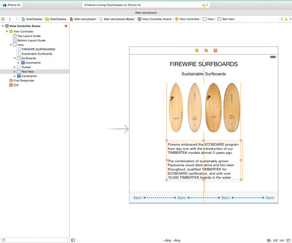
You may have noticed that while we were changing the label text size, entering text, and adding an image – that orange lines began appearing around the labels and image views. This is Auto Layout telling us that something is now out of whack with our constraints. So before we begin working with size classes, get all Auto Layout issues resolved!!
There are a couple indications that something needs fixing. First off we have a yellow exclamation badge with a 3 next to it at the top of interface builder. Secondly there is a small red arrow next to the “View Controller Scene” in the Document Outline.
The easiest way to fix this is to head up to the EDITOR menu and select RESOLVE AUTO LAYOUT ISSUES then select RESET TO SUGGESTED CONSTRAINTS.
Magically all the orange lines, the three warnings, and the red arrow disappear.
Build and run for the 5S,6, or 6 plus in the simulator. The results will all be the same no matter which device you choose.
In portarit mode everything looks okay but in landscape mode we loose a label and the text view.
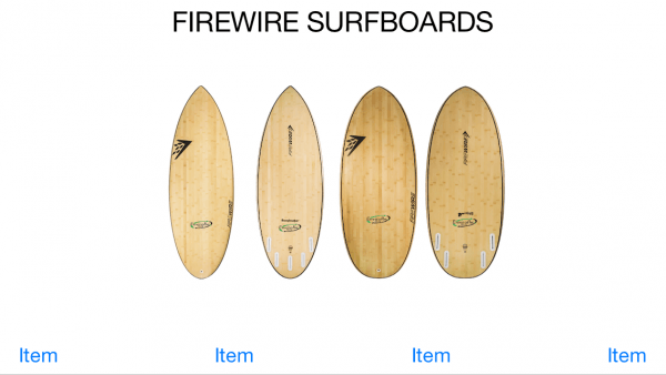
Let’s fix that. We’ll change the size class so it displays a view of an iPhone in portrait mode.
Click on “wAny hAny” and select the size class which will work for all iPhones in portrait – “Compact Width/Regular Height”.
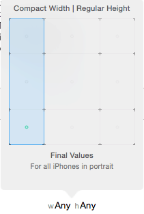
Two things happen. The representation of our design space changed, it now looks like a portrait view. The bar at the bottom that indicated “wAny hAny” is now blue and says “wComapct hRegular”.
Looking at our size class view, The text view could be a bit closer to the toolbar, but basically this is okay and looks good when run in the simulator. But now let’s change size classes, and look at this in landscape view.
To switch to the Landscape representation, click on “wComapct hRegular” in the blue bar, the grid pop-up appears, select “Any Width/Compact Height”.
The display changes to a landscape view. Our text view and second label are gone. The size class bar is still blue and indicates we are looking at the size class wAny hCompact. Additionally we have a warning. Clicking on the yellow triangle warning it says 4 views are vertically ambiguous.
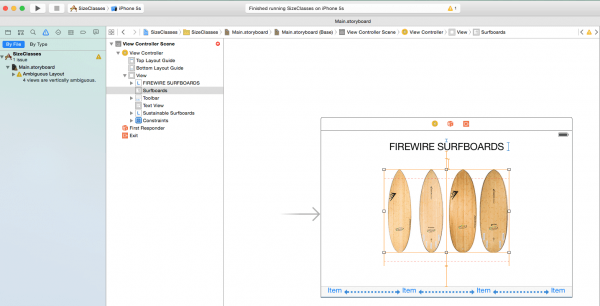
We’ll get to the warnings, but first let’s create some space in landscape.
Do not delete. Uninstall.
To give ourselves a bit more room in “landscape” and to illustrate what can be done using size classes, we’ll remove the Toolbar from this Size Class.
Do not delete it. We will simply uninstall it for this size class. If you delete an object it is thrown away-deleted from your entire project.
If you “uninstall” an object while working in a size class, it will be uninstalled just for the class you are working with as indicated by the description in the blue bar, BUT will appear in other size classes where it was not “uninstalled”. THIS is the power of working size classes.
Select the Toolbar in the Document Outline. The first step is to uninstall all the constraints for the toolbar. When you select the Toolbar, and then in the utilities pane select the Size Inspector, you will see a list of constraints for the Toolbar. There are 5 listed. These were put there by Xcode when we selected “Reset To Suggested Constraints”. All need to be uninstalled. There are at least two ways to do this.
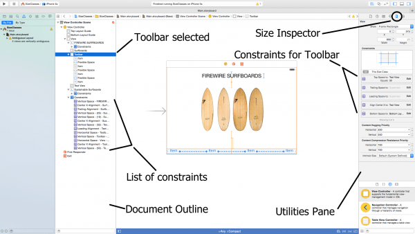
The first method:
From the Document Outline you could find all the constraints that relate to the Toolbar, select them, and then hit the key combination of Command+Delete. Note that it is not delete but Command+Delete. That key combination will uninstall the constraint from the view.
The second method:
In the Utilities pane with the Toolbar selected the constraints associated with the Toolbar are listed.
Double click one and an edit box appears. The selected constraint is displayed. It is also grey highlighted in the Document Outline. In the Utilities Pane with the edit box displayed, there is a faint + sign and a blue check box which says installed. (A1)
Click the + symbol.(A2)
A pop up appears and here you select the current size class you are working in. In our case it is “Any Width | Compact Height”.
Now, “wAny hC” is listed in the edit box (A3).
Uncheck the box for “wAny hC”. You have now uninstalled that constraint on the Toolbar.
Repeat for all other constraints on the Toolbar.
Once all constraints are uninstalled, select the toolbar in the Document Outline. Verify no constraints are part of the Toolbar.
Now we need to uninstall the Toolbar by pressing Command+Delete.

Okay let’s look at what we did. Switch to “wCompact | hRegular” (portrait). Our Toolbar is present! Switch to “wAny | hCompact”(landscape). Our Toolbar is gone!
But now we have Auto Layout warnings! Yes. That’s the just how it is. We’ll have to fine tune things here and in the process we may completely mess things up and end up with garbage which is why I said, make a back up!
Notice there are no warnings in “wCompact | hRegular”, but there are warnings in “wAny | hCompact”. So staying in our “wAny | hCompact” view let’s really shake things up!
I’ll make the image a bit smaller so that we can bring up the text view. Select the image view and grab the top right corner… you can also use the size inspector to change the size. Scale it back to 240X160.
Uninstall both labels. The process is to first uninstall the constraints, and then uninstall the label. Do that for both labels.
The labels are now uninstalled but where did the Text View go?
In the Document Outline select the Text View.
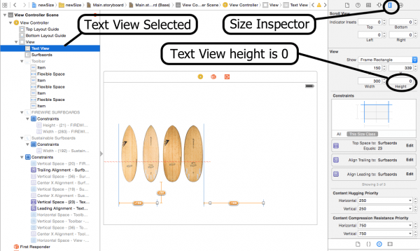
Notice with the Text View selected, the size inspector is indicating it’s height is “0”. I don’t know why this happens. But I have found while working in size classes that when things disappear the size of the object has been changed. It is still in the view, but it’s size got reset to 0? It may be an Xcode bug or it maybe a function of something I am unaware of. Moving forward, reset the size of the Text View and continue working.
I will adjust the size to be the same as the image, 240X160, and I’ll position it next to the surfboard image.
Now we have room for the toolbar again. Re-install it just to get used to working with size classes.
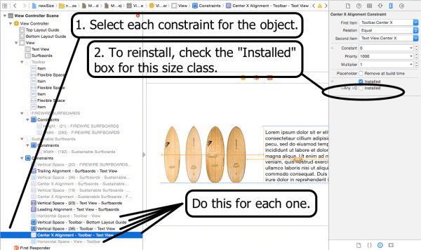
Reinstalling it is just a matter of selecting each greyed out constraint in the Document Outline and checking the box in the Utilities pane size inspector.
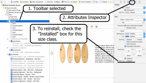
Lastly, reinstall the Toolbar by selecting it in the Document Outline and navigating in the Utilities pane to the Attributes Inspector. There you will see the check box to be checked.
Now let’s add a new label above the image and text view. Drag a label from the object library onto our “wAny hCompact” size class in the storyboard. Set the label text size to 30 and I’ll enter “Firewire Sustainable Surfboards”. My Size Class now looks like this:
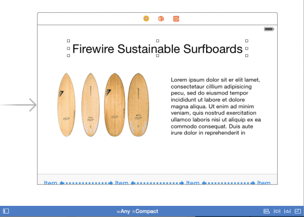
In our landscape view we have removed two labels, added one large label, repositioned and resized views, uninstalled and reinstalled a toolbar… All that’s left is to get the Auto layout errors resolved.
Select the label in the storyboard. In the EDITOR menu select ALIGN and select HORIZONTAL CENTER IN CONTAINER.
With the label still selected, “control+drag” from the label to the Top Layout Guide. Choose VERTICAL SPACING.
With the label still selected, In the EDITOR menu select PIN and WIDTH.
Select The Image. In the EDITOR menu select RESOLVE AUTO LAYOUT ISSUES and for the selected view choose CLEAR CONSTRAINTS. This will clear the constraint only in this size class and only for the selected object.
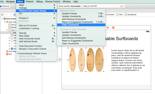
Notice the upper and lower section. Be sure to choose the upper selection. Clear the constraints on both the image and the text view so that we are starting with a “clean slate”.
Once the constraints on the objects are cleared it will much easier to add new constraints and start fresh. Trying to fix constraints on an object that already have orange or red lines can be frustrating. It seems to me that Xcode has done a better and better job of making Auto Layout your friend. The more you work with it, experimenting with the settings, adding constraints, clearing constraints, adding again… you will eventually begin to love Auto Layout.
Now that the constraints are cleared on the image we have to add constraints back in. To make your life easier, start by getting the objects positioned where you want them to be. Both objects have the same size dimensions so I’ll line them up in the view side by side. I’ll also make sure my left object (image) is 20 points away from the edge of the view-container. And that the right object (text view) is 20 points away from the right edge.
In Xcode terms this is to say the “leading edge” of the image view is a constant of 20 away from the container margin. The right edge of the Text View is called the Trailing Edge. All objects have a Leading Edge, Trailing Edge, Top, and Bottom.

I could “Control+Drag” from the object to the left edge… release the mouse and select “Leading edge to container margin”. I could then again “Control+Drag from the object to the Top Layout Guide… release the mouse and select “Top Space To Top Lay Out Guide”. I could continue doing this until all the needed constraints were applied. But let’s allow Xcode to try and and set my constraints first.
Select the image and from the EDITOR menu select RESOLVE AUTO LAYOUT ISSUES. When the next menu appears, from the upper section (selected view) select RESET TO SUGGESTED CONSTRAINTS.
After doing this I have a couple issues. An orange line and a few warnings. But look at all the work Xcode did for us with one click. Seven constraints were added to tether, or constrain, our image to the view. But Auto Layout is all about one objects relation to another. Before trying to get rid of these warnings, perform the same procedure on the text view.
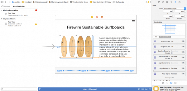
Select the text view, and from the EDITOR menu select RESOLVE AUTO LAYOUT ISSUES. When the next menu appears, from the upper section (selected view) select RESET TO SUGGESTED CONSTRAINTS.
All of the warnings are gone, and all our constraint lines are blue. Why? because the image view was dependent on the text view, and the text view had no tethers or constraints. You’ll also notice in the Utilities pane Xcode added four constraints to the text view. It didn’t need seven because the two objects are working off each other.
Auto Layout is very powerful and we have barely used a fraction of it’s capabilities.
Click on the Size Class in the blur bar and switch to the iPad view. The Size Class for all iPads is “wRegular hRegular”. In the iPad configuration you’ll see our original two labels in both portrait and landscape.
With the additional screen space you can redesign the look for iPad while preserving your layout for the iPhone. As you have seen you can control/change four areas:
1. If a view is installed in the view hierarchy (add or remove views).
2. Change a font – size for buttons, labels, fields and text views.
3. The value of – or specifications for – a constraint (size or position of a view).
4. If a constraint is installed in the view hierarchy (add or remove a constraint).
I hope this helped de-mystify Size Classes and will get you started designing universal apps with confidence!
NOTE: One additional tip. If you want to change a font size or style of a label in a size class, select the object, navigate to the Attributes Inspector in the Utilities pane. Notice the very faint and very small + button next to the Font. Click it.
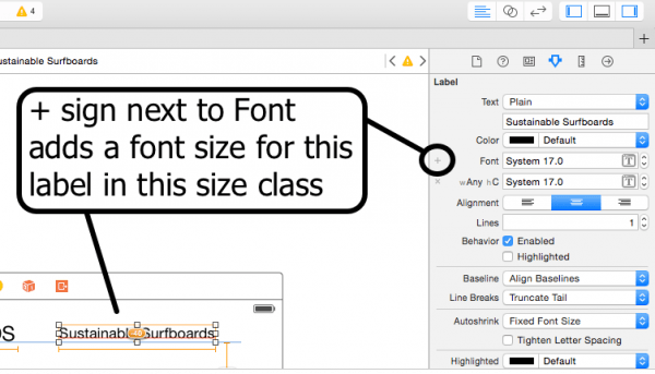
A popup appears and we can now customize the font size and style for this size class.
steven says
Hello,
Do you know how can i upload rtf file to urtextView in Xcode 6.3 swift code?
Thanks