The SwiftUI framework provides the tools you need to create the layout of your app. Two of these are the Spacer and Divider, both of which are views as they conform to the View protocol.
Views in SwiftUI are made up of other views—even down to the simplest building blocks like Divider, Spacer, or Text. When you create your own view (which often starts as ContentView), you can rename it to anything you like. One of the first things you’ll usually do is start pulling in other views like Text, HStack, or VStack to build your layout.
Every element in SwiftUI conforms to the View protocol, which means you can combine them freely—like snapping together LEGO bricks. This composable system is what makes SwiftUI so flexible and powerful.
Adding Spacer and Divider Views
In this tutorial we’ll take a look the Spacer and Divider views to see what they do and how they can help your layout.
import SwiftUI

struct SpacerDividerExampleView: View {
    var body: some View {
        VStack(alignment: .leading) {
            Text("Header")
                .font(.largeTitle)
                .padding(.bottom, 10)

            Divider()

            HStack {
                Text("Left Item")
                Spacer()
                Text("Right Item")
            }
            .padding()

            Divider()

            VStack(alignment: .leading, spacing: 20) {
                Text("First Section")
                Divider()
                Text("Second Section")
                Divider()
                Text("Third Section")
            }
            .padding()
        }
        .padding()
        Spacer()
    }
}
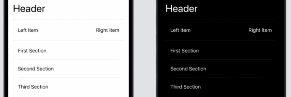
The example above is a fairly simple approach to laying out data on the view. The SpacerDividerExampleView Has a VStack with a Text view, followed by a divider that puts a horizontal line across the view, and then is followed by a HStack.
In that HStack are two Text views and between them is a Spacer view. The Spacer reminds me of the spring in Storyboards where you typically had struts and springs, the spring being the part that pushed two views apart. This is what happens here, the two Text views are pushed horizontally apart. If it was in a VStack then it would push views vertically apart.
We then add another Divider below the HStack, and then a final VStack that has Text views separated by Dividers.
At the end of the view, we add another Spacer to move everything to the top of the view.
Pethaps Spacer and Divider are two of the more simpler views in SwiftUI, they still enabled better layouts and bring something useful to your app.
Leave a Reply
You must be logged in to post a comment.